Thursday, March 31, 2011
my experience of assignment 9b
This assignment really got brain moving and my creative juices flowing. I some trouble with photoshop, but I think it was good to get back in there and try it, since I ussually do my projects by hand. Designing the logo took quite a bit of time- it didn't take long, and it wasn't hard to get the 4 circles to represent an abstracted four leaf clover, but the lettering took forever. I couldn't deside which fonts I wanted, and I was trying to pick three different fonts for each. Now I know I should have just picked one and stuck with it throughout. Even though I had some difficulties, I am pretty happy with the results, especially the business cards. I'm glad we did this project. It was something new and different for me; and I learned the difference between a logo and a word mark.
9b - black and white
Here are my logos in black and white. I don't know what was wrong with it before, but I finally was able to upload them - yea!
logo 1 in black and white:

logo 2 in black and white:

logo 1 in black and white:

logo 2 in black and white:

Wednesday, March 30, 2011
9b - continued
Mission Statement:
We are greatly dedicated to the quality of our products and their process and to relationship with our clients. We strive to grow the mind and hands through creativity and skill; and to educate and give back whenever we can.
About Us:
Send us your information and your clothing and fashion designs- sketches, photographs, videos and more. Our board reviews them and we do our best to help you bring your creations to reality, or showcase any clothing lines that you've already made. We help bring the designer from sketchbook to the runway- offering workshops on fashion design and the fashion industry, help with networking (especially with other designers and fashion companies that can put your work on the market), and assistance with beginning fashion shows to show case your talents. We work with our clients in their style, and until they meet their own goals. Many very talented staff members, several of whom are also designers, are available to aid in the creative and technical processes. Each client who is dedicated to the program is required to meet periodically with a staff member of their choosing, to make plans and measure progress. We greatly promote the achievement of our individual and group clients, but also benefit fashion shows and cause oriented functions related to fashion. We are a new, but rapidly growing foundation of about
1, 000 members, professionals and cliants.
It's all clothing! Make a statement! Grow your skills! Express your creativity!!


Friday, March 25, 2011
Check It Out!
assignment= Please identify five art/design websites that have compelling content worth sharing with the class. Please :
*Check out these cool websites related to art and design!
1. University of Michigan- School of Art and Design
www.art-design.umich.edu/
2. Otis College of Art and Design
www.otis.edu/
3. Inhabitat: design will save the world
http://www.inhabitat.com/
(a sort of "go green" approach to art, design and architecture)
4. Design Top News
http://www.designtopnews.com/
5. Designflavr: daily design and visual art inspiration
http://www.designflavr.com/
(really cool art on guitars, plus lots more)
yet another example of Composition in art

from: anoizes.com
This abstract art picture is intriguing compositionaly, I think, because it has two masses of objects as the focal point, and yet nothing within either of the two masses draws the eye to a particular part of, or item in it. However, one mass does appear larger than the other. Notice the the two masses are also placed in the center of the overall composition, and so draws the eye to the center in that way as well. I think it's also very pretty.
another example of Deco style
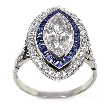
from: newyorkestatejewelry.com
This is interesting. Here is an engagement ring in the Deco style. It has its curves, but definitely has its points too. I think it's beautiful.
Assignment 1b -Criticism
Finally, here is my criticism assignment, but better late than never I guess.

Here is panel #7 of the Katrina Chronicles: Volume II. I was drawn to this one because it was one of the few pieces that had only one drawing on it, and because of the pink flamingos. Pink is my favorite color. The shape of the bird and its posture is quite interesting, I think, the way the neck is a long as its body and cranes down from top to bottom and then out. This large flamingo is the focal point of the composition and has a physical dominance over the whole picture, as it is, I believe, meant to represent the idea of “how having someone severely guarding things makes it hard to get a job.” The series is about, Peter Prescott’s struggles to get a job and make money to support his family, among other things, and here we see yet another physical indication to the above said representation, in that, the flamingo is closely guarding the telephone. Notice that in the background, there are other flamingos, but they are not dominant, or as physically large as the one in front, neither do they seem to be paying much attention to anything, but whatever they’re doing. Still, the difference in the size of the three birds in back and the one in front is also to relate a sense of distance and space between them. The three are farther away than the one. Furthermore, in the large flamingo, can be seen a good example of texture, especially in the wings and feet. The neck particularly gives us a sample of curvature lines, fluid lines, such as is found in Nouveau art and many other styles. There are also aspects of Deco art and other similar styles that revolve around straight lines and sharp edges, (more of a square, or geometric object-look), in the bend of the front leg, the crank of the neck and in a few parts of the beak. Personally, I find the use of shadows and white space in this composition to be very interesting. There is a shadow under each of the large flamingo’s two legs; which could attribute to both the mass, weight of the bird itself, but also could be meant as yet another indicator of the creature’s dominance. Next, notice the large amount of white space at the top of the composition- if the large flamingo was taken out, the white space would make up the majority of the picture. The white seems to highlight the shape of the creature, but also may be present as a representation of “nothingness” to go along with the theme of the difficulty of getting a job. Notice that the landscape presented in the composition is also quite plain, basic and even white in sections. The water between the parcels of land is a rich blue, perhaps symbolizing good times amongst worried times. Then, the parts of land themselves, are small and narrow- like stepping stones, and I think it’s safe to say, “traverse it carefully.”

Here is panel #7 of the Katrina Chronicles: Volume II. I was drawn to this one because it was one of the few pieces that had only one drawing on it, and because of the pink flamingos. Pink is my favorite color. The shape of the bird and its posture is quite interesting, I think, the way the neck is a long as its body and cranes down from top to bottom and then out. This large flamingo is the focal point of the composition and has a physical dominance over the whole picture, as it is, I believe, meant to represent the idea of “how having someone severely guarding things makes it hard to get a job.” The series is about, Peter Prescott’s struggles to get a job and make money to support his family, among other things, and here we see yet another physical indication to the above said representation, in that, the flamingo is closely guarding the telephone. Notice that in the background, there are other flamingos, but they are not dominant, or as physically large as the one in front, neither do they seem to be paying much attention to anything, but whatever they’re doing. Still, the difference in the size of the three birds in back and the one in front is also to relate a sense of distance and space between them. The three are farther away than the one. Furthermore, in the large flamingo, can be seen a good example of texture, especially in the wings and feet. The neck particularly gives us a sample of curvature lines, fluid lines, such as is found in Nouveau art and many other styles. There are also aspects of Deco art and other similar styles that revolve around straight lines and sharp edges, (more of a square, or geometric object-look), in the bend of the front leg, the crank of the neck and in a few parts of the beak. Personally, I find the use of shadows and white space in this composition to be very interesting. There is a shadow under each of the large flamingo’s two legs; which could attribute to both the mass, weight of the bird itself, but also could be meant as yet another indicator of the creature’s dominance. Next, notice the large amount of white space at the top of the composition- if the large flamingo was taken out, the white space would make up the majority of the picture. The white seems to highlight the shape of the creature, but also may be present as a representation of “nothingness” to go along with the theme of the difficulty of getting a job. Notice that the landscape presented in the composition is also quite plain, basic and even white in sections. The water between the parcels of land is a rich blue, perhaps symbolizing good times amongst worried times. Then, the parts of land themselves, are small and narrow- like stepping stones, and I think it’s safe to say, “traverse it carefully.”
Wednesday, March 23, 2011
example of Composition in art

from: cebufameswedding.com
I like this example of composition in art. Notice the use of smaller and larger objects, though they are all birds, and the use of positive and negative space. Also, where does it draw the eye to?
example of Surrealism in art

from: arthit.ru
I feel this is a very pretty and interesting example of surrealism. I like how a small portion of each hand peaks up, out of the water, like the green island in the center. It reminds me of how it might have looked when God formed the Earth. The hand also seem to be almost supporting/ holding up the island, and also moving the current of the water around it. I also really like the colors used in this painting, and how the water just kind of fades into the horizon; there really isn't much of a line there. Overall, this painting gives me a peaceful feeling.
Tuesday, March 22, 2011
NOTE on 8b
Please note that the connections between the the Nouveau piece and the Deco piece are that the larger, center shoe has the same orientation in both, and that in both, the entire composition- center focal point and border are completely made up of the object- the shoe.
Thanks, -Lisa
Thanks, -Lisa
assignment 8b -Nouveau

Here is my Nouveau peice. I first took a picture of the shoe on my cell phone, put that on my computer and then printed it out. I actually printed three pictures of the shoe- one full page= 8 1/2" x 11", and two 5" x 7"pictures. Next, I placed a piece of tracing paper over each print-out, to get the basic outline of the shoe. Then, by putting the tracing paper on top of my 11" x 14" sketch paper, and going over the outline drawn on the tracing paper with a pen, I was able to make an indention of the shoe's shape on the sketch paper. The shoe in the middle of the composition is taken from the 8 1/2" x 11" picture and the smaller shoes that make up the border around it are from the 5" x 7" pictures. Instead of just going over the indention, this time, I just used the indention as a guide for myself, and free-handed with curved lines, but tried to keep it around the same area and shape of the origional. So this was the final result. I wanted to create an obvious center of attention with the large shoe in the middle- to draw the eye right there. The border was easier this time. This time I wanted to do just two shoes on top and two on bottom, instead of three. Again, they are alternating, or are opposite, but the other change is that the whole shoe shows and not just part of it. Also, I tried to keep the fluid lines of the nouveau style throughout the composition. I don't know if I was completely successful with this composition either, but I think it turned out pretty good, and I enjoyed doing it as much as the other one.
assignment 8b -Deco

Here is my Deco design drawing of the original object- my shoe. I first took a picture of the shoe on my cell phone, put that on my computer and then printed it out. I actually printed three pictures of the shoe- one full page= 8 1/2" x 11", and two 5" x 7"pictures. Next, I placed a piece of tracing paper over each print-out, to get the basic outline of the shoe. Then, by putting the tracing paper on top of my 11" x 14" sketch paper, and going over the outline drawn on the tracing paper with a pen, I was able to make an indention of the shoe's shape on the sketch paper. I went over the indention with a thin marker. The shoe in the middle of the composition (the deco shoe) is taken from the 8 1/2" x 11" picture and the smaller shoes that make up the border around it are from the 5" x 7" pictures. Still, these pictures just gave me the outline of the shoe(s); all the shapes inside the large, center shoe I put in myself. I had some trouble deciding what to do with all the curves that came naturally with the shape of the shoe; I wanted to keep the natural shape, but I needed to make it more geometric as well. So this was the final result. I wanted to create an obvious center of attention with the large shoe in the middle- to draw the eye right there. The border was a little tricky; I thought of trying to show the small shoe at different increments, (drawing the shoe, then each time- rotating it counterclockwise or clockwise a certain # of degrees, and drawing it again), but I decided random positions was more interesting. However, I did arrange it so that on top it alternates- toe, heal, toe, opposite of what it is on the bottom, which alternates- heal, toe, heal. I also just tried to keep the geometric shapes and defined lines of the deco style throughout the composition. I don't know if I was completely successful with this composition, but I think it turned out pretty good, and I enjoyed doing it.
Wednesday, March 16, 2011

Tuesday, March 15, 2011
deco style in art

This poster gives a lot of good examples of deco style. I think the shapes, designs and colors are so interesting, intricate and pretty.
Color assignment- write-up for matching a classmate....
Again, I had a good experience working with acrylics, and this time, I didn't squeeze out too much paint. I found this matching part of the project to be a lot harder to do than my composition. I had almost no problem matching the colors, but matching the lettering was tough. Though, I think I was fairly successful overall.
The following are the paints I used to make the specific colors:
Tree= phthalo green, blue lake, titanium white
Tall= burnt sienna, titanium white
The following are the paints I used to make the specific colors:
Tree= phthalo green, blue lake, titanium white
Tall= burnt sienna, titanium white
Color assignment- write-up for my composition
First, I looked at several different color and lettering options on the computer, and printed out the ones I liked best. Then I moved to paper. I found the acrylics to be good paints to use, just had to keep them, and the brushes wet. I did squeeze out too much paint to start with, so I guess I wasted some, which is too bad. Anyway, I chose four colors and four adjectives and tried them out. Below is the list of colors I mixed together to make each one(they are already matched together):
Plain= titanium white, lemon yellow, brilliant red, blue lake
Plum-eggplant= titanium white, blue lake, brilliant red
Irish= lemon yellow, blue lake, titanium white
Bonny= blue lake, brilliant red
Angry= brilliant red, lemon yellow
Raving= brilliant red, blue lake, titanium white
Vibrant= brilliant red, titanium white, lemon yellow
Youth= lemon yellow, titanium white
*I chose "Irish Bonny (pretty)."
I had to practice a few times first, and I kept changing my mind about the lettering, but I finally made a decision. It was a little hard getting the "y" on the end of "Bonny" the way I wanted it to be.
Even though it was time consuming, I really enjoyed working on this project; color and painting are my favorite parts of art.
Color assignment- 2nd Part- matching a classmates colors and lettering


-above are two practice runs:

-above is the final product for the "matching a classmates colors and lettering" part:

Monday, March 14, 2011


color assignment- picked colors and lettering


Color assignment- the pre-process


-all the colors and lettering changes I considered for my two sets of four.

Saturday, March 12, 2011
Fauvism and Expressionalism in art
 from: visual-arts-cork.com
I like the soft, yet distinct edges of this work. It also is very realistic; and the expression on the lady's face is in the details of her features and how she positions them, how they're portrayed.
Wednesday, March 9, 2011
another example of text and color

from: makeuseof.com
I know Valentine's Day is over, but I thought this was a really nice example of text and color, or should I say colored text, or text in color ... haha.
-including form, with it being in the shape of a heart; plus, note the contrast between the two hearts - dominant and subdominant.
2nd example of Art Nouveau

from: elfwood.com
Look at how those colors work together so well. The color shades are very similar to each other, and yet you can make a clear destinction between them at the same time. I think it's clever and pretty.
Tuesday, March 8, 2011
example of Art Nouveau

from: allcostumejewelry.com
I think this is so beautiful, intricate, and almost dream-like in its soft tones. It's an object too (a bowl); again, with Art Nouveau, we find their are many canvases, or forms of them.
Wednesday, March 2, 2011


Subscribe to:
Comments (Atom)