4th Composition:
I think the geometric abstraction worked out well in the 3rd Composition, but I thought the organic abstraction in this one turned out even better. Here again, I kept just the head of each close-pin, but instead of closing the shape into the form of a circle, I just did free-hand squiggly lines down both sides, keeping the same length of the original pieces. Notice that only the "squiggles" on the left side come out of the heads of the close-pins, while the ones on the right side come out of those. The lines are more fluid and irregular. I think this gives it a nice flowing feel -like water waves, or perhaps, if when looking at the composition as a whole, it appears to be like a flower, both of which I think, fit well with an organic feel. (This one looks like a sunflower to me).
5th Composition:
Here, there is even more abstraction. I worked from my organic abstraction piece (4th Composition); changed the proportions by lengthening and shortening them, and by changing the width/thickness of some of the shapes. I also simplified the form, (at least with the center circle), by removing the heads of the close-pins and placing them outside the proposed circle, so that the center circle could be seen more specifically and plainly. I added on a "squiggly shape" to two of the ones on the left side of the object, partly because I wanted to add some complexity and partly because I noticed that the overall composition was not as well balanced as I'd like. I'm not sure I like the addition, or know if it really adds or takes away from the overall composition.
6th Composition:
This is an abstraction through reversals. I wanted to make this one fairly simple, with easy-to-point-out reversals. All I did was to mark the center circle and the yarn in the same places as before/always, and then turn my tracing paper around, going counter-clockwise, to trace the up-side-down image of each close-pin in their designated spaces. This was fun; I did have some trouble with spacing between the items on the left side of the composition, but overall, I think it came out pretty good.
7th Composition:
Here is my composition of multiples; there are three copies of the object in this composition. I wanted to experiment with the focal points; I thought of drawing the multiples of the object in such a way, so that the one would either lead into the next one, or fit/disappear under it, or go over/cover it. Instead, I decided to draw the object in the center of the page, as usual, and then draw the other two, on either side of it, in such a way, that they all intersected and overlapped each other, especially the center one. I was interested to see how it would turn out, and I like what I got.
8th Composition:
This composition, which was meant to be focused on non-objective abstraction, was the hardest one for me to make, because I had trouble deciding how much of the original shape should be kept in or taken out. Though, I think it turned out fine. Again, I went with the simplified center circle, but this time, didn't even include the shapes of the close-pin heads. Then, I made just a very simple outside line, on either side, to represent the presence and length of the body of each close-pin. It also just serves as a boundary line for that part of the object. The small curved line inside each one of these, represents where each close-pin "splits off into its little tails". I thought of completing the "tails", but I decided not to because I didn't want the composition to be too close to the original. (I think this one looks like a ceiling fan).
*Even though this project was very time consuming, I had a lot of fun doing it, and am pleased with the results overall!
Monday, February 28, 2011
write-up for project (read this 1st)
I made the original shape (found on the first 8" x 8"), with old-fashioned wooded close-pins, glued together using a glue gun. I colored each close-pin using markers, and tied on a multi-colored yarn at the top, for the object to hang from. Please note that this is a Christmas ornament that I made awhile ago, without this project in mind; so I decided not to color my drawings of the object, so that all the lines can be seen clearly. After printing off a picture of the object, I copied it onto a piece of tracing paper. This I used on each of the eight compositions; by pressing hard as I went over the object on the tracing paper, I made an indentation of the object on the sketch paper, and then just went over it with a thin marker. The tracing paper was essential to keeping the same shape(s) and very helpful on the abstraction compositions in being able to place parts of the overall object in a different position or area, than it was originally. Also, the seeming center circle of the object, is not an actual complete circle, I marked where the glue bulged when it dried, in order to keep the close-pins together. As you will see in some compositions, if the heads of the close-pins are moved, there is not a complete circle left behind. Variety in these compositions is hopefully evident. As far as unity between them, I strived to keep the orientation of the overall object the same (the yarn at the top, as if the object was hanging down from it), as well as, staying with the same general circular shape of the object, and usually keeping the placement of the proposed center circle, with the other shapes streaming around it and branching off of it. I am pretty pleased with this project overall!
1st Composition:
I drew/traced this using contour line. I experimented with the thickness of the line, forming it on the bottom for the left half of the object, and on the top for the right half of the object. It seemed to definitely give some volume and depth to the piece. (I think it makes it look like a ship's steering wheel, although I didn't intend it to).
2nd Composition:
Here, I added ovals and incomplete triangles (alternating) to the ends of the object, for embellishment. It seems also to just add shape to the whole composition. I drew lines diagonally across the close-pin shapes to give it a Local ttexture, which seemed appropriate for something that's made of wood. Notice that the lines on the close-pins with the ovals on the ends, go down diagonally, left to right, and the ones on the close-pins with the incomplete triangles on the ends, go up diagonally, left to right. (Although I didn't intend it, I think I made the close-pins look like striped frogs doing synchronized swimming. I put a face in the object's center circle to be as if a huge frog was sticking his head up, out of the water as part of the performance. I was tempted to put a face on each of the "little frogs", but I thought that would deviate too far from the original).
3rd Composition:
Keeping just the head of each close-pin, I closed the circle and drew, coming down from each, geometric shapes- a triangle, a smaller circle, two triangles off of that and then one triangle off of each of those. I didn't calculate a specific degree(s) measurement for the angles of the triangles; I wanted it to be varied. The tip-top point of each of the triangles on the left, on the outermost part of the object, connect with the bottom right corner of the triangle above it, and the tip-top point of each of the triangles on the right, on the outermost part of the object, connect with the bottom left corner of the triangle above it. There is an exception to this. The two parts of the object that are hanging down, across from the yarn; their tip-top points of their outer triangles meet their above triangles at various, different points. (This composition reminds me of a Native American dream catcher).
re-project
Below is my project. The first picture is the original object I worked from, then the pictures going down in order- Composition(s) 1 through 8. I wanted to post them like this now, so at least I'd have them up on this blog, just in case I don't get a chance to put up better quality ones later.
- write-up coming soon.
Lisa Schwab
- write-up coming soon.
Lisa Schwab


Wednesday, February 23, 2011
2nd example of romanticism in art

from: traumwerk.stanford.edu -black and white
This is so intricate and beautiful. Again, notice the "softness" of the design. At least to me, it has a peaceful feel to it.
example of Romanticism in art

-This is kind of dream-like. Notice the use of soft colors.
Monday, February 21, 2011
line and texture- 2
from: factoidz.com
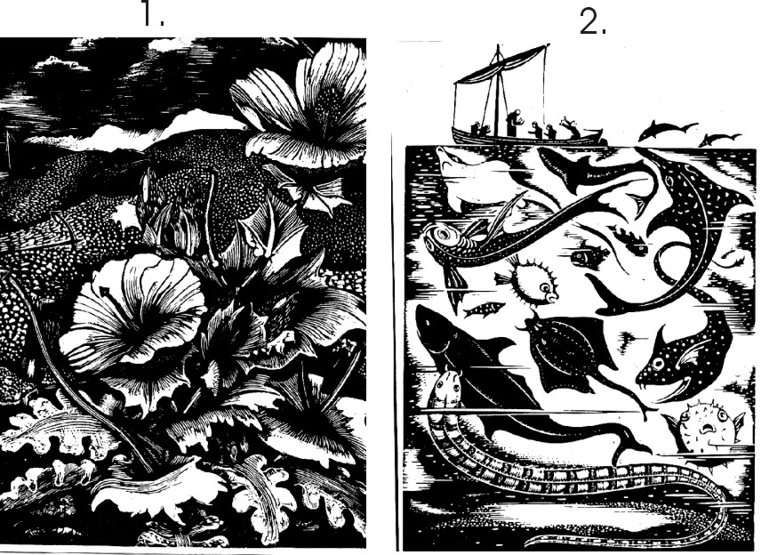
I think these are fascinating and a great example of line and texture. They certainly make our human world look small compared to that of the world of nature.
Saturday, February 19, 2011

example of text and color art
 from: vi.sualize.us
This is an interesting/fascinating image I think, and example of text and color combination. There is writing on the wall and the person is the same color as the wall. hmmm, it reminds me of a Superhero movie.
example of renaissance art
 from: thevillagegallery.com
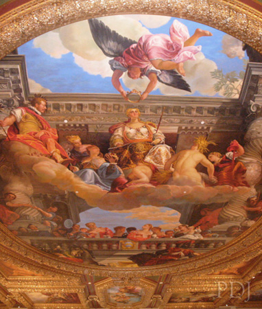
-so beautiful and intricate! I think the angel with the crown looks as if he's really flying.
 from: linesandcolors.com
space, shape, perspective 2

from: integrallife.com
Here's a good example of all the different points of perspective/interest/focus there is in one shape. Nice.
space, shape, perspective 1

from: teachingcompany.12.forumer.com
I thought this model was very interesting; there's such a big contrast between the curvature of the seats and the "flat and straightness" of the proscenium stage here. The two are also very close to each other, unusually so, for the way most modern structures are designed. The architechure is beautiful too!
Wednesday, February 16, 2011
Tess. Project

I decided to do this project on paper, instead of Photoshop, and am pretty happy with the results. First I had to tape together two 81/2" by 11" sheets of paper, and cut off the extra to make it 11" by 14". Then, I followed the directions in the class notes to form the triangle(s), and make cut-outs from it, etc. I used one basic shape and five colors. To make the multicolored diamonds, I first, made the line of the four pieces all in one color, and did it for each color I was using- pink, green, orange, blue. When I had cut out enough sets of each color, I mixed the pieces all together and tried out different color orders, until Ifound one I liked. Notice that the first diamond, (upper left corner), on the top half, goes pink, green, orange, blue, while the bottom half is green, pink, blue, orange; and the diamond in the lower left corner is the same, but the halves are switched. Likewise, the upper right Conor diamond goes orange, blue, pink, green on top, and blue, orange, green, pink on bottom; while the diamond in the lower right corner is the same, but here again, the halves are switched. I put together one row (one half of the diamond) together, with tape on the back, did the same for the other rows; then just taped two rows together to make the diamond shape, and glued that in place. The purple was ment to be a filler for the design, but also an intersection "X", and the middle of it is on the center spot of the paper. I wish I had done more than just one color here. My lining up of the shapes isn't the greatest either, but overall, I feel good about this project and I had fun with it.
Saturday, February 12, 2011
geometry- my assignment 3
Here is my project. The scan didn't work, so here it is in cell phone pictures.


 repeat


For all four book pages, I followed the class notes to draw the Van de Graaf Cannon. Then I placed the golden rectangles and found their golden points, and chose one to place an event at, in each rectangle. For the first golden rectangle I created an "X" as the event, and made the design/markings that are all over it with the center of a fake diamond-like object. The second rectangle has a circle at the event space, and the design/markings were made by pressing down a piece of embossed paper. The third, has a diamond at the event space, and the design/markings are made from a small, thick piece of rolled-up cardboard. Finally, the fourth golden rectangle has a square at its event space, and the design/markings are made with the top of a marker cap. Black ink was used for all. The first two rectangles relate to each other in that the design/markings on both, go across (horizontal), the rectangle, and the second two rectangles relate to each other in that the design/markings on both, go up and down (vertical), the rectangle. I tried to create designs/markings that would not draw the eye (as instructed to do), but I'm not sure if I was completely successful in this, or not. Also, I really enjoyed doing this project- it was just a little challenging, but different from the art work I normally do, and it was a lot of fun!
-Lisa Schwab


 repeat

For all four book pages, I followed the class notes to draw the Van de Graaf Cannon. Then I placed the golden rectangles and found their golden points, and chose one to place an event at, in each rectangle. For the first golden rectangle I created an "X" as the event, and made the design/markings that are all over it with the center of a fake diamond-like object. The second rectangle has a circle at the event space, and the design/markings were made by pressing down a piece of embossed paper. The third, has a diamond at the event space, and the design/markings are made from a small, thick piece of rolled-up cardboard. Finally, the fourth golden rectangle has a square at its event space, and the design/markings are made with the top of a marker cap. Black ink was used for all. The first two rectangles relate to each other in that the design/markings on both, go across (horizontal), the rectangle, and the second two rectangles relate to each other in that the design/markings on both, go up and down (vertical), the rectangle. I tried to create designs/markings that would not draw the eye (as instructed to do), but I'm not sure if I was completely successful in this, or not. Also, I really enjoyed doing this project- it was just a little challenging, but different from the art work I normally do, and it was a lot of fun!
-Lisa Schwab
Tuesday, February 8, 2011
tessellation art pic.

frame/geometry art pic.

fields/emphasis art pic.

roman art pic.

greek/hellenistic pic 2

greek/hellenistic pic 1

stone age pic.
 from: skyvillage.com
Here's an example of stone age art. I found it compelling because it is more "in depth" than most of the cave paintings we see, and notice all the different shades of red. I never before really thought of people in the stone age having all different shades of the same color. I wonder how they made them, (what different plants did they use, etc.).
Subscribe to:
Posts (Atom)